Basic navigation on a tablet
When you open a web client module on a tablet:
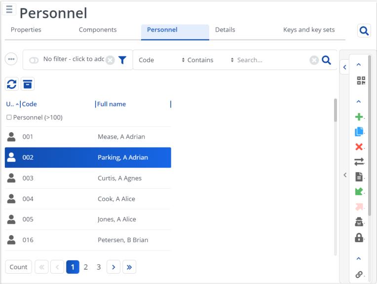
• the elements list is shown
• the data panel is hidden
• the action panel is shown minimized
• the quick search and filter panels are available
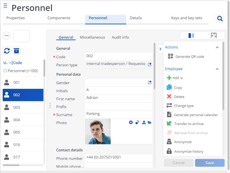
All these panels can be expanded and collapsed to optimize the available space on the screen. These user settings are stored for every selection level and step. Your settings are retained when you log in next time.
This image displays a module on a tablet with only the elements panel expanded. The action panel is collapsed, just displaying the icons.

This image displays a module with all three panels (elements panel, data panel and action panel) expanded on a tablet.
